My Entire Mobile Application Process
A complete breakdown of my mobile application process in 2013
Published by Vincent Pickering
on
Intended as a companion piece to my previous post on my frontend process, this post discusses my App design processes, there is some overlap so I recommend if you enjoy reading this post you should also check out the other one.
Unlike many App designers, I do not focus exclusively on iOS and have created Apps in the past for multiple platforms and designed some Apps to work across many platforms. This type of App design presents many different challenges you may not be familiar with, which can become especially complex when focusing on mobile Apps and their different interaction methods, App store submission processes, resolution sizes or when you have to design an App that must support multiple platforms.
Don’t Guess, Actually Use The Platforms
The majority of designers tend to use either an iPhone or Android for their daily life and whatever is your platform of choice you would be reasonably comfortable if tasked to design an App on that device, and while there is some overlap between Android and iPhone, what about a Symbian or a Blackberry? What about being asked to design a desktop App for Windows 8?
Not only are each of the interaction models different between these platforms they have their own quirks and nuances, its second nature for an iPhone user to double tap the home button and close an App running in the background, but a Windows Phone user designing on iPhone may not know this.
My daily phone of choice is an iPhone, but while this has won out in the feature set for me, I try to remain open minded:
My requirements and means are not the same as someone else’s.
This philosophy should carry through when you design on a platform you do not use on a daily basis. If I have to work on a Windows Phone I spend a few days interacting with a Windows Phone before I start the design process. If I have access to a device I take it home and try to do many of the normal tasks I would do with my phone, if I can’t get access to a device from work, I ask a friend who owns that device to show me a few things, or go down to a mobile phone shop (or a PC world if it’s a Windows 8 desktop App) and simply play with the demo models. The important thing is to refresh your brain and stop thinking in your platform’s default interaction mode, retrain your thinking temporarily. Just because you have settled on one platforms method doesn’t mean you should force others down the same path. If you get this right on the platform, the users will love you for it.
On a related note, it’s commonplace for designers to laugh at platforms other than iPhone and Android, deriding the feature set over their ‘ superior ’ platform choice. Try to get out of this habit and view each platform as an opportunity to be the great App on that platform. If all the competition is terrible, it should be far easier for you to score a home run right?
I’ve designed Apps in the past before on Symbian that have outperformed Apps on iPhone and Android in download numbers simply because Symbian is huge in lower income countries like India and the number of great Apps to download are far more limited. In a sea of great iOS and Android Apps you have to be exceptional to get noticed and even then the App may not get much use due to all the choice available to the user. If there are only a few good ones, not only will you get larger download numbers but the App itself will be more frequently used, a double win.
Mobile Apps
Mobile Apps are a bit more complicated to assemble effectively, not only do you have to decide on navigation within the App screen layout and the user state(s) you also have to think about external factors interacting with the device. Mobile phones have a wealth of peripheral sensors that can give you incredibly interesting data, especially when you use them in an unexpected way.
Bringing harmony and order to this initial chaos is the part I enjoy most in the App design process, feeling the way through to the solution that seems just right. I start by listing my success criteria, in the form of:
- User should be able to XXXX.
- User should not be able to XXXX.
I then break them down further in to User Stories and Use Cases. It’s important at this stage to try to catch all the success criteria in the App and define what the App will not do just as much as what it will. Remember if this is the initial App creation do not get too ambitious, focus on core values and principles and make them great. Ultimately all the features in the world won’t save you if the initial idea and approach aren’t right for the user-base. Anything I capture in this stage that I decide will not make the initial release I keep in a separate list that I can present to the client later. Having a roadmap for new features and timings to add they can be essential to the growth of the App and building the working relationship with your client. The more the client can plan costs, measure success and see a return, the more likely they will fund your ideas and trust you when you want to take a chance on something radical. I think of it as:
When your spending someone else’s money make sure you can pay them back
Be Flexible In Your Approach
After I have assembled the Use Cases my approach to design the App is flexible based on the platform(s) it will need to support, so I’ll expand each approach and its reasoning individually.
Single Platform Apps
Single platform Apps are probably what you are most familiar with and the most popular. They not only allow you to focus on only one platforms challenge and quirks but give you a much wider set of goalposts to aim for.
I favour a rapid design approach. App design yields far better results when you actually use the software and test it in a real world scenario. There is something special that happens when you physically hold the design in your hand not only do you learn very quickly what is working and not working for yourself and other users but it can help you discover additional functionality or a new direction in your design you may not have considered.
So to this end, I start with an blank notebook and quickly begin sketching labelled boxes, don’t worry about sizes, straight lines or being neat in general, at this point all we are doing is trying to establish general areas of functionality to satisfy our Use Cases within the App. This work will most likely change a lot so don’t focus too much on it being perfect. In order to work out what feels right we need to try all the wrong things first and the quickest way to get closer to that is to just put it somewhere it’s far easier to move things around than to stare blankly at a page and get frustrated, think of it as a jigsaw, you have all the right pieces, you just need to put them together in the right way.
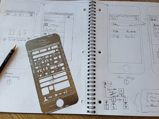
Once I have something I am roughly OK with, I begin to add more fidelity using a UI Stencil they are a great way to focus on a higher fidelity mock-up and not get too distracted by the look and feel but at the same time keeping it neat and fast to draw.
I map out the screens one at a time until I think I have them all, then at this point I create an information map. An information map is like a site-map mashed up with a functional diagram, it’s a great way to map out key functions in Apps. Depending upon the complexity of the App you can map out individual Use Case routes or display all the key routes on one diagram.
The reason I create the information map after mapping out the screens is because this part is always an iterative process, mapping out the screens help you define how a Use Case is going to be implemented, and the information map allows you to understand the UX at a high level. You will inevitably change and tweak things at this point, so having a reasonable level of definition in the wire-frames helps to ensure things will work and flow in a user friendly way.
Once the core functionality has been defined and worked out in the wire-frames and information map, I then move on the Error Cases. This is often a part that is overlooked, but it is essential before you begin the designs to understand:
- What a user will be able to do, and how it is handled by the system.
- What a user will not be able to do, and how it is handled by the system.
- Where the user can carry out each task within the geography of the system.
Once you have these three cornerstones everything else will slot to place around them.
Now I document this entire process and create the living doc that will require sign off from the client at various points in the process.
I create a Functional Specification document. Building software of any type is complicated. Hard and challenging for both you and the client. You need to ensure throughout the process everyone is happy and working in the same direction. If someone is unhappy they have points in the process to be heard and their concern or suggestion addressed. The single largest point for Apps failing is the breakdown in the relationship between the client and the creators. Creating the Functional Specification document not only protects your work with a written traceable document should a problem arise later, but it also protects the client against your going off in the wrong direction and keeps you honest!
I have tried many ways in the past to manage this document and this largely depends upon the client, some prefer an on-line version, others prefer a Word document, the important point to note is that the client needs to actually interact with the document or the process falls down so I keep mine in Markdown and convert to the format I need depending upon the clients wishes.
Now comes the fun part, I take the Information Map with the sketched wire-frames and re-create them in [Keynote] using my Blueprint rapid prototyping framework. This allows me to very quickly make high fidelity wire-frames. I then export the screens to [Flinto] and link them up to test. This is a very powerful and prominent part of the process, not only can you iterate very quickly and discover mistakes, dead-end ideas and things you got wrong. It’s a great touchstone point with your client. Once you have teased out the large bugs and clangers, get the prototype in the client’s hand early on, get them playing with it, excited about the App and their feedback on your direction, choices etc.
Now all the initial UX work is done we can start designing!
I follow the same process for collecting visual inspiration and deciding artistic direction as I do with sites.
While in my work designing on the web I have been unable to ditch Photoshop yet, I have recently transitioned to [Sketch] for my App designing. It’s a fantastic tool to work with and has a ton of great tools to speed up App design. While designing I also use [Skala Preview] with this plugin to allow me to see the design taking shape in real-time on the phone. Adding this context really helps you get sizing and proportions right. Things that seem a great idea on killer large iMac screen don’t always seem the best idea on a small iPhone 4 screen later.
In my opinion, there still is a gap in the market for a great designer version of GitHub. It always makes me nervous when designing that I may loose something I really want to revert or keep later. I have tried Adobe Creative Cloud, which is basically Dropbox, with more storage as standard, but goes down constantly and is pretty unreliable. Layervault was a better alternative, but I also ran in to issues with content not being saved properly and a lot of slowdown every time my computer loaded.
So to recap, now we have:
- User Stories
- Use Cases
- Wire-frames
- Error Cases
- An Interactive Prototype
- Designs
- A Functional Specification document detailing all the interactions, measurements and design implementations.
It may seem like a lot of work upfront, but it’s amazing how much time is lost or spent with developers having to make their own decisions on how to implement something poorly defined or asking for guidance from the client. These “on the hoof” decisions often miss out something or fail to take things in to consideration, leading to a larger bug fixing stage or a disconnect between the initial App design, wire-frames and the finished product. You want to allow the developer to get on developing the App and writing code, when a designer has no content they are the first person to complain it’s holding up the process, so treat developers fairly and give them everything they need to do their job too.
Multi-platform Apps
Building Apps that span more than one platform is quite an extensive problem when you are tasked with making them. The initial problem is that the user flows and UX on each device will be different meaning you have to take these in to account when you design the initial App UX. Given that money is always limited and time is especially limited, depending upon the type of platforms you have to support you are left with 3 approaches:
- Use the native controls and keep things generic.
- If you have to support iPhone and Android only you can create a custom UI that shares many similarities with minor deviations for their native design patterns.
- Create a completely bespoke UI and ignore all the design conventions for each platform.
Once you have chosen your way the next headache is screen size and resolutions. When you design your Apps consider the movable space between the elements, build in tolerances to these areas so they can take a bit of movement, it will save you money and time that you can then spend on the edge cases which may require more bespoke work. If you have to design for Android, spend time understanding how 9 sliced PNG’s work, it will save you a large amount of time later dealing with none-standard screen sizes.
I once worked on an App for a major mobile phone company in the UK. It had to support all the handsets they sold at the time. 70 different devices across iPhone, Android and Blackberry, and all the screen sizes that come with it.
When you are dealing with screen sizes as small as 240px wide and low powered, all the way up to a huge Samsung S3 and everything in-between a fixed interface doesn’t cut it, similarly a bespoke App creates its own set of headaches. If you are ever faced with this mammoth task as I was you will need to do to manage the task a bit differently to the usual approaches.
Split everything in to two categories the low powered devices and the high powered ones. This will most likely give you a pretty decent split in the screen sizes as in general, the bigger the screen the more powerful the phone driving it. For the disobedient few phones that don’t fall in to this category try to downgrade them unless there is a valid reason to include them in the higher powered category. You’re working on a complex problem and you shouldn’t make it more complex unless you have to.
Once you have your split, apply the native controls and interface to the low powered phones. The reason to do this is because you are most likely to run in to the more complex problems (or lengthy) to solve on a low powered phone than a new one so use the pre-built tool-kits to give the users as much functionality as possible. Users of these devices will be happy they got included at all so try not to sweat the small stuff over pixel perfection here, you’ll only burn all the money on unseen problems you made yourself that both clients and users can’t appreciate.
For high powered devices, I would craft a bespoke interface that will work across all the high powered devices. This way you are boiling down a highly complex design and UX task in to 2 smaller jobs. A fancy posh UI and a lower grade functional one.
Native or HTML?
The eternal debate roles on over which is better, personally I am not going to try and tell you which you should develop on, however what I can tell you is that in my own experience I have seen the following:
I have worked with clients that have created HTML Apps under the idea it is written once and applied to all platforms, which should work out cheaper than creating Apps natively. The theory is sound. The issues always arise that certain sensors are not available on some platforms and they are on others. Often direct access to native software is not available on one platform where another is completely open. This uncertainty causes a lot of hold ups in development leading to costly and expensive work around(s) and features being unavailable on certain devices. What tends to happen is that the initial cost works out the same or slightly cheaper than the native implementation, but the code-base is much harder to maintain due to all the work arounds and additions. What this means is that over time the App becomes burdened by past decisions or requires substantial re-factoring exercises to keep it easy to work with and the costs ramp up with each release. The other problem with a HTML approach is that re-creating a native look and feel is at present fighting a losing battle meaning you will always need to create a bespoke interface so it doesn’t look out of place on the device.This isn’t down to just the look and feel though. Browsers running on a mobile device have a small amount of latency in the response time, it’s detectable to humans and we notice it is slightly not the same as a native implementation.
That said, its easier to find a few JavaScript developers and have them all be familiar with one code-base so they can do any task than have individual programmers for each discipline and be heavily dependent upon them to all deliver the same consistent quality on each device. Weigh up the pro’s and cons for what you want to achieve and most definitely check before starting that the HTML approach supports the hardware functionality you need if you want to do it that way.
Design Debugging
When it comes to debugging design issues further down the line, I utilize a combination of Dropbox and Instashare to take screenshots and share them for comparison between designs and the finished product.
App Store Submission
Finally, a short note on App stores approval. This is often something that gets overlooked until then end of the process, but I encourage you to make this one of the first things to research and plan. The main reason behind this is that each platform has a slightly different App approval process, for example if you are creating an App for Symbian or Windows Phone you must submit all your design documentation for sign-off by Microsoft/Nokia before submitting your final App code, where they will request changes should you not be following the design interaction guidelines, it catches a lot of designers out. Make sure you know at the start of the process what you must deliver at what time and things will run a lot more smoothly for all involved.